We have an almost inescapable habit of focusing on high-traffic areas of our built environments. You know what we’re talking about—the glamour spots—the buzzy hotel lobbies packed with technology-rich amenities for work and play; the bright and calming reception areas at medical offices; and, of course, the massive collaboration zones that act as the showcase space for the brain power and activity within corporate campuses.
Packed with detail and the potential for large-scale business transformation, these are the very types of spaces that get all the design love and attention. But, should they? In a world where every square foot is an investment, how do we best utilize the unsung heroes around us—the spaces between? We’re talking about the lonely hallways, the break rooms, and other often-undervalued spaces in our built environments. From a leading manufacturing facility to an edgy retail banking outpost, let’s explore the unexpected culture builders and people connectors these spaces can be with a strategic design focus.

First up: a retail bank that also does double duty as a workspace for NSWC Federal Credit Union’s critical operations departments. To help the financial brand ditch the ‘80s—both in look and in banking approach—our design team delivered a modern industrial space that evokes all the charm of a traditional Main Street storefront, with the very best retail and workspace design elements mixing to create a rich, people-first experience.
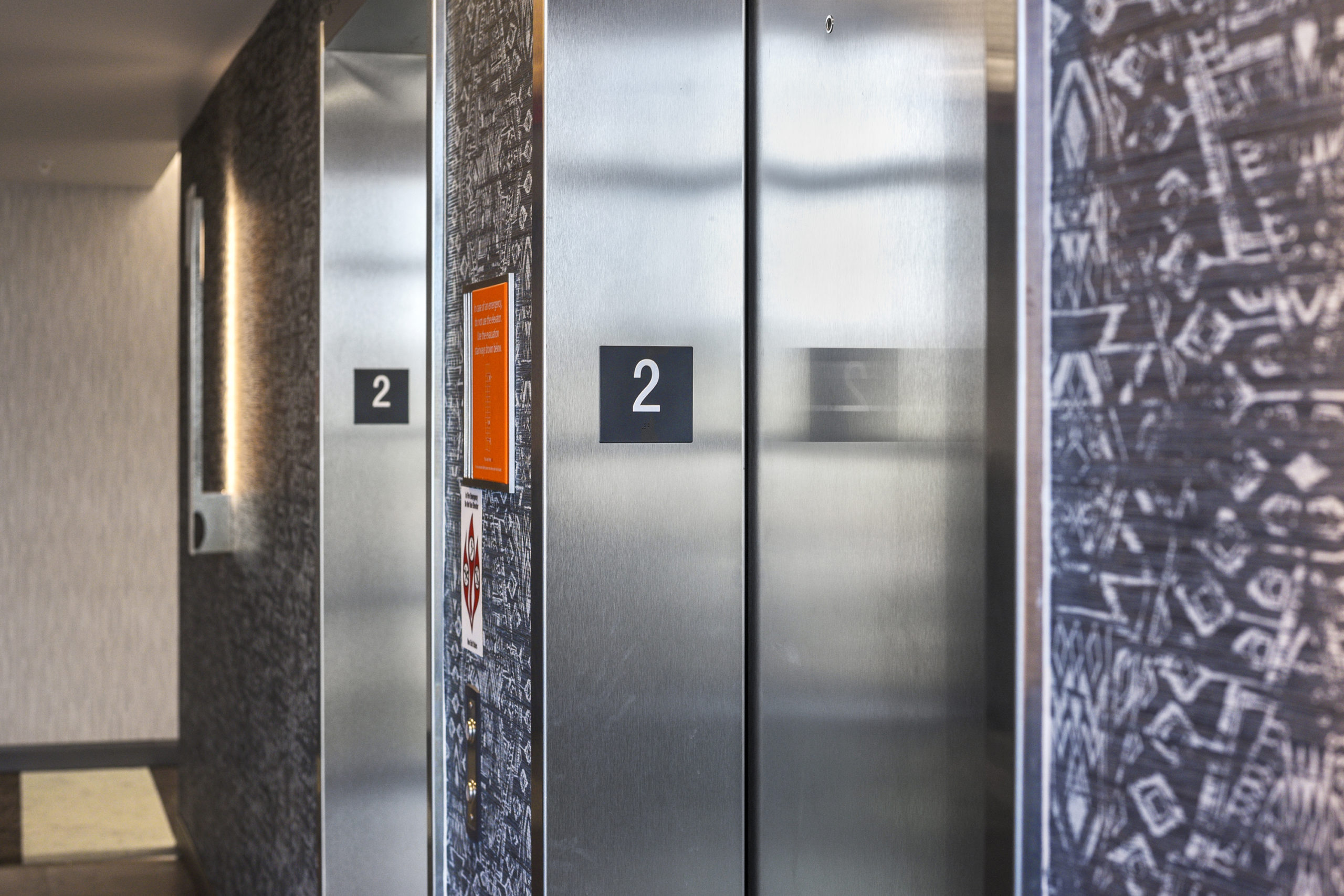
Within the two-story 10,800-SF operations center, are a number of flexible and efficient spaces—from a community lounge and rooftop terrace to a modern IT suite with an overlooking mezzanine. But there’s one small space, in particular, that really showcases the potential of interstitial space, and that’s the hallway that connects the retail lobby to the bulk of the center’s dedicated workspace areas. It’s a simple corridor that could have easily been overlooked, but the project’s interior designer, Cassie Joyce, recognized the potential of this small nook early on.
“Luckily for us, this client saw the inherent value of having an additional employee break area set aside for staff to do everything from eat lunch to have informal meetings,” she says. “So, for me, it was important to tap into what the space needed to really draw people in and activate the surroundings. It’s one thing to merely design a space; it takes extra effort to incorporate the sort of intentional features that ensure people actually use it.”
Motivated to draw foot traffic to the break area, Cassie gave the space a sense of familiarity, weaving in the same Caravaggio lighting, wood cabinetry, and tech capabilities as the main employee lounge and member center lobby. What really tied the small space together, though, was a set of carefully selected pieces of furniture: two 42” custom-built Fraser Woods wooden tables on wheels with matching stools.
“The table’s capability to move easily helped us embrace the space’s small-but-mighty scale,” Cassie says. “Employees can reposition the table as they see fit, transforming it into a truly multipurpose and communal area for all.”

Having worked for numerous manufacturing and logistics leaders, we can tell you that a technical facility lives and breathes off progressive ideas and efficiency. Maximizing space within these facilities is always a challenge; however, in the case of one particular production environment that we’ve been evolving for more than a decade, our very first design step was all about operations and culture. Out of the 1.5M-SF manufacturing facility, the most radical change occurred within a mere 2,000 SF.
“A lot of production plants have underutilized space,” says Jeff Taylor, a project designer for our manufacturing and logistics studio. “So, often, the best course of action is to think beyond linear space, and instead look up.”
Instead of immediately dismissing the floor-to-ceiling space on the production floor, Jeff helped our client (we’re sworn to secrecy and can’t name the trucking giant we work for, but guess away!) take advantage of the vaulted environment. Refreshing an unused supervisory deck that overlooks the production floor, the design team incorporated an open layout, modernized lighting and flooring, and more vibrant colors. Unsurprisingly, (powerful) change ensued. The mezzanine not only boosts the plant’s usable square footage, it also acts as a sophisticated design element that subtly integrates two departments that were traditionally siloed from one another. Not to mention, the facility has seen a substantial uptick in both profitability and retention rates over the years.
“Because the open-air mezzanine literally connects production to administration, it’s helped blur the lines of a historically segmented work culture,” Jeff says. “That’s allowed for increased collaboration and candid conversations between employees on the production floor and those in office positions. What was once an overlooked space is now the heart of company operations.”

Punchy and playful, the Moxy hotel brand is decidedly not for everyone. If you’re unfamiliar with its raucous and spirited atmosphere, all you need to know to understand its shtick is that check-ins happen at the bar. For the Gold Key Award Finalist Moxy New Orleans, we often looked beyond our team’s work on the bold exterior boasting neon pink signage to the clever features and amenities for guests inside—each one a clear sign that this is a brand that unapologetically caters to its target guest. (Shout out to our partners in crime on the project leading the interiors, Stonehill Taylor!)
Case and point: A bathroom break at the Moxy is actually a catalyst for adventure and fun. What could be, and often is, just another boring wall by the restrooms gets activated by a custom vending machine. It’s easy to get distracted by the blow-up doughnut, but let’s instead focus on the vending machine goodies. Who wants to buy Cards Against Humanity for a quick game with friends? Maybe someone forgot their selfie stick, or needs a quick nail polish fix.
Our takeaway from the intentionally eye-catching design and amenities at the Moxy reminds us that you can energize the spaces between if you consider what you can put in them and why they make sense for that specific brand. How will people navigate and experience what’s around them? How does the placement of a single vending machine spark activity and connection to other spots throughout the property?
The possibilities are endless.

Typically, the in-between spaces are diminished to simple pass-through areas without purpose. Handled with the utmost of design care, however? Well, those spaces between can make a radical and profound impact on how the people within connect to each other—and the greater environment around them.
Make every square foot count, we say—because there’s not a single spot that doesn’t have the potential power to be a total game-changer.